Web design has a tremendous impact on on-site consumer behavior. For starters, it is well known that great design drives positive brand perception and that it directly influences on-page engagement rates.
But did you know that your site’s design also has an effect on your revenue? According to scientific research, there’s a direct correlation between website quality, user satisfaction, and consumer purchase intention, demonstrating the importance of designing pages that convert.
Of course, there are many approaches to designing and building websites to maximize sales. But the simple truth is that achieving above-average conversion rates doesn’t require reinventing the wheel. In fact, it’s entirely doable by simply following a set of tried-and-tested design-related conversion principles that work.
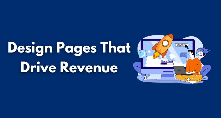
So, are you looking to design pages that drive revenue? Here are the top rules for creating a website that sells, along with some tips for implementing these strategies in your online presence. Let’s get into it.
Resolve Customer Pain Points → Build Brand Trust
What’s the very first thing your website needs in order to drive conversions? Well, if you look at some of the latest research on consumer behavior (and purchase-influencing factors), you’ll find that a high-converting site must drive trust.
Now, you may be confused about the connection between design and brand credibility. You may even feel that trust-building has much more to do with branding and marketing than design. However, the simple fact is that most people do form brand impressions (particularly about authority, competence, and trustworthiness) based on design.
So, to boost conversion rates and drive revenue, start your web design journey by prioritizing tactics that will position your business as credible, dependable, and customer-centric.
There are several ways to do this. Something as simple as incorporating plenty of hyper-relevant social proof into your online presence can be tremendously effective.
However, if you want your audience to instantly associate your business with a trustworthy solution, explore opportunities to resolve your target audience’s pain points, even without getting anything in return.
RE Cost Seg does this beautifully with its Depreciation Calculator, which helps its leads figure out the amount they can save on their real estate taxes. The interactive piece of content isn’t just a handy tool that addresses a need.
More importantly, it’s the perfect demonstration of RE Cost Seg’s ability and competence to address customer pain points as well as its willingness to prioritize customer satisfaction above profits, both brand characteristics that are massively effective at building brand trust.
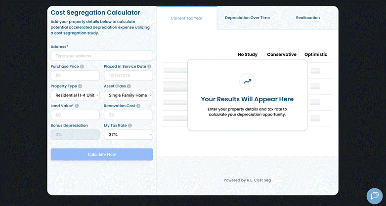
Source: recostseg.com
Reduce Clutter → Drive Conversions Faster
Once you’ve convinced first-time web visitors that they can and should rely on your business to resolve their pain points with speed and efficacy, it’s time to optimize their path toward an actual conversion.
One of the best design principles that can help in this regard is to actively avoid and reduce webpage clutter. Why? Because too many elements can stretch your web visitors’ attention, preventing them from engaging with genuinely conversion-inspiring content.
In the design world, this principle is called the Hicks-Hyman Law. Essentially, it stipulates that the more choices a person is exposed to, the longer it will take them to make a decision. The hypothesis also aligns with the idea that informational overwhelm leads to analysis paralysis, suggesting that minimalism is a truly effective strategy for driving conversions and revenue.
Naturally, you don’t necessarily have to go in an extremely minimal direction to speed up your web visitors’ decision-making processes. Something as simple as surrounding key elements with sufficient negative space is more than enough to drive conversions. If you want to give minimalist web design a go, that’s a solid choice too.
For a great example of a completely uncluttered landing page, check out Nothing. The brand makes a conscious effort to highlight the quality and simplicity of its products, saving all additional information for the relevant product pages, where shoppers can easily learn why they should consider purchasing these items.
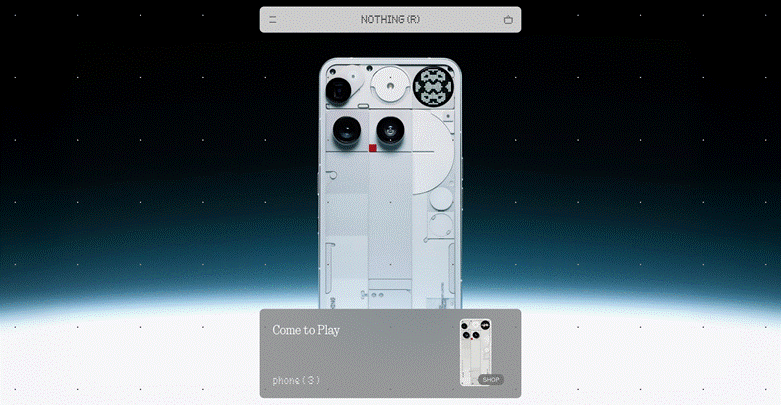
Source: nothing.tech
Position High-Value Elements Above the Fold → Maximize Engagement
According to the NN Group, web users spend the majority of their browsing time consuming content in the first screenful of a webpage. So, if you know that your audience is likely to spend 57% of their time on your site looking above the fold, then the only logical conversion-boosting solution you can adopt is to position high-value elements in this area of your site.
Now, the specific type of website element that will provide the highest conversion value for your brand hugely depends on what you’re selling (and to whom). However, in most cases, showing off your unique sales propositions and CTA buttons will be sufficient.
If you want to go above and beyond, and ensure that your prospects are truly invested in exploring your offer, you can use this section of your website to facilitate fast pain-point resolution.
For instance, if you look at John Campbell, you’ll find that the business dedicates the hero section of the homepage to a functional search function, encouraging visitors to browse the brand’s offer and begin their buying journey as soon as possible.
The effect isn’t just a better user experience (which positively affects purchase intent). This design decision also helps shorten the sales cycle, allowing the business to boost conversions and reduce the time it takes for prospects to go from awareness to a purchase.
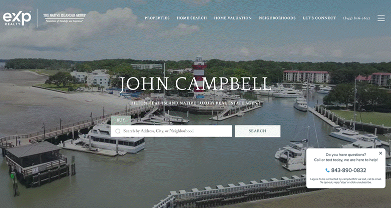
Source: johnsellshiltonhead.com
Simplify Text-Based Content → Improve Comprehension and Enjoyment
It’s no secret that today’s consumers prefer not to read online content word-for-word. The fact that almost 80% of people scan pages to find information, as well as the increasing popularity of video (both for entertainment and product understanding), clearly shows that capturing and retaining your audience’s attention necessitates a very thoughtful approach to producing webpage content.
Now, if you’re looking for conversion principles that truly work, one of the best web design tactics for you may be to simplify your text-based content and replace it with more accessible and enjoyable formats.
Visuals, for example, are an amazing content type for boosting conversions because they’re (often) attractive and they help message comprehension. Additionally, they can help simplify text content and even boost readability by visually separating different concepts or benefits, which is precisely what Custom Sock Lab does on its How It Works page.
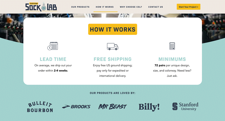
Source: customsocklab.com
Or, if you want to take this conversion principle to the next level, you can employ video to communicate product benefits, a tactic that perfectly aligns with most consumers’ preference for learning about products by watching video, and empirical evidence suggesting that 84% of marketers have successfully increased sales through video marketing.
Optimal Technical Performance → Maximize User Experience
In some cases, the best conversion principles to help you design pages that sell don’t actually have anything to do with design (at least not overtly).
The simple truth about web performance (and conversion potential) is that it can’t work without a real interaction between aesthetic design and UX performance. Yes, perfecting one of these aspects of your site is an excellent first step toward increasing revenue. But if you want to surpass the median landing page conversion rate of 6.6%, you’ll have to do more than just the basics.
That’s where technical performance comes in.
Seeing as some of the most powerful aspects of customer experience have to do with speed, security, and accessibility, focusing your conversion-boosting efforts on building a more enjoyable and easy-to-browse website can truly pay off.
You don’t have to go deep into the technical aspects of web design, especially not if you hire a professional website development service like Red Stag Labs. Nevertheless, ensuring that your digital presence loads fast, is mobile-friendly, and utilizes all the necessary security protocols is an amazing first step toward enhancing user experience and boosting conversion rates.
Use Emotion → Build Relationships That Increase Purchase Intent
One of the most commonly overlooked conversion principles for driving revenue is that the typical customer journey isn’t a purely rational path from awareness to purchase.
Instead, research shows that most consumers make buying decisions based on emotional needs (or impulse), signifying that one of the best ways to drive sales is to evoke an emotional response from your audience.
Again, there are many methods to reach this goal, from producing visuals and copy that address your ideal customer’s positive or negative feelings to simply aiming to build brand-customer relationships via authenticity.
On the one hand, Eight Sleep does the former by promising potential customers that they’ll receive “the best sleep [they’ve] ever had,” knowing that this is the exact desired outcome that makes the brand’s audience interested in acquiring one of its products.
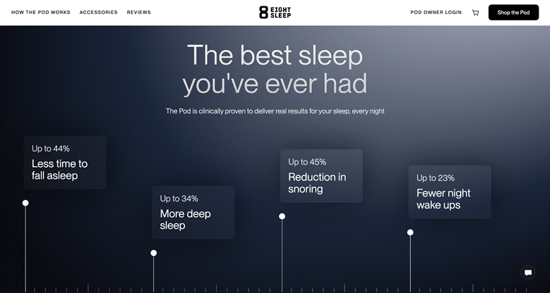
Source: eightsleep.com
On the other hand, brands like ShiftCam achieve emotional customer alignment by sharing their missions and values, creating a strong sense of belonging simply by showing they want the best for their prospects, which, in turn, makes those shoppers more likely to convert into customers.
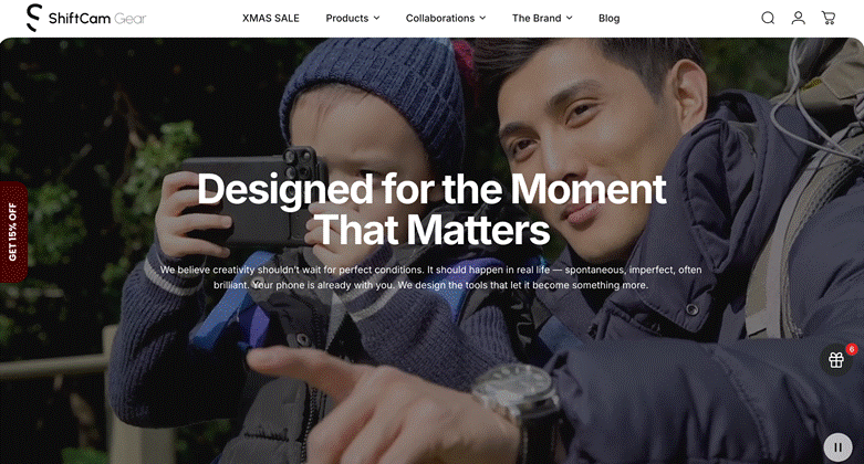
Source: shiftcam.com
Prioritize Clarity → Remove Common Conversion Killers
Finally, as you explore principles that will help you design pages that drive serious revenue, don’t forget that convincing your audience they should purchase your solution doesn’t close the sale. You still have to ensure they actually go through with buying your products and (ideally) repurchase them in the future.
The reason for this is simple. Even when consumers’ purchase intent is high, research shows that many don’t follow through. According to the Baymard Institute, cart abandonment rates average at 70%, with some of the main reasons people don’t complete transactions being high shipping costs, slow delivery, lack of price transparency, and low brand trust.
So, if you want to maximize your chances of effectively driving revenue through conversion optimization, it’s crucial that you prioritize clarity in a way that removes your target audience’s most common conversion obstacles.
Tell your customers what they should (and shouldn’t) expect regarding shipping. Be transparent about your return policies. And try to be as informative about all purchase-related costs as possible.
For inspiration on how to do this, check out Mind Lab Pro. This brand uses visuals to address key conversion obstacles (such as shipping cost, cancellation policies, etc.), knowing that these play a huge part in determining how safe shoppers feel about buying from a brand and understanding that clarity effectively drives conversions, profits, customer satisfaction, and loyalty.

Source: mindlabpro.com
Final Thoughts
If you’re looking to drive business revenue and facilitate brand growth, investing in your website is non-negotiable.
Ultimately, your target audience is guaranteed to interact with your website. And if they don’t like what they see, their chances of converting into customers will plummet.
By enriching your web design strategy with the conversion principles discussed in this guide, your chances of seeing positive results will grow significantly. Yes, you’ll still have to tweak your approach here and there, just to ensure your web presentation aligns with your ideal customer’s wants, needs, and expectations. But you can rest assured that these improvements will translate into results and a significant boost in conversions.