Most small businesses don’t have the luxury of name recognition. You’re not Amazon or Nike. People won’t give you the benefit of the doubt if your website is clunky, confusing, or outdated. They’ll leave. Fast.
That’s why your website can’t be just a box to check. It’s a direct reflection of your business. If it looks professional, loads quickly, and is easy to navigate, people will assume you run a solid operation. If it’s a mess, they’ll assume the same about your business. It’s how online first impressions work.
Luckily, you don’t need a massive budget or a design degree to get this right. Smart choices like clear navigation, mobile optimization, and a layout that guides visitors to what matters can go a long way.
Here’s how to build a website that actually works for your business. Let’s break down what matters most and how to get it right.
Customer Testimonials Can Boost Trust and Credibility
Before making a purchase, 81% of buyers do their homework. They read reviews, compare options, and look for proof that a business delivers on its promises.
A well-placed customer testimonial can be the reassurance they need. It’s one thing to say your service is great and another to let happy customers do the talking.
People trust real experiences more than marketing claims. Testimonials provide social proof, showing that others have used your product or service and had a positive outcome. They help remove doubt and make potential customers feel confident about moving forward.
However, not all testimonials are effective. To make them work for your business, keep these best practices in mind:
- Use real names and details.
A vague “James T. from Ohio” isn’t convincing. When possible, include full names, locations, or company names. - Keep it natural.
Testimonials should sound like real people wrote them, not scripted marketing copy. If they read like ads, they lose credibility. - Place them strategically.
Don’t hide testimonials on a separate page that no one visits. Feature them on your homepage, service pages, and checkout process to reinforce trust where it matters most. - Use multiple formats.
Written quotes are great, but video testimonials and case studies add an extra layer of authenticity.
A Brand Doing It Right: RE Cost Seg
RE Cost Seg, a firm specializing in cost segregation services for real estate owners, understands the power of testimonials.
They prominently display customer feedback throughout their website, showcasing real clients who rave about their experience. By letting customers speak in their own words, they make it clear that their service is reliable, effective, and well worth the investment.
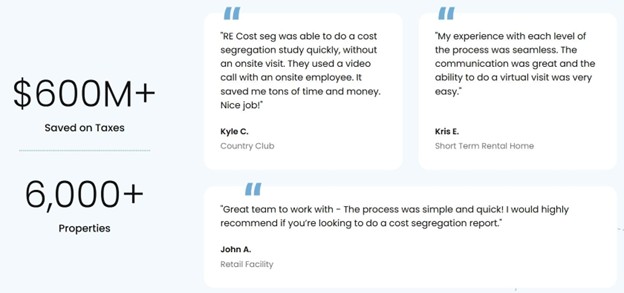
Source: recostseg.com
This is a simple strategy that works because potential customers see proof, not just promises.
Immediate Customer Support Can Establish Loyalty
When customers have questions, they don’t want to dig through FAQs or wait hours for an email response. They want answers fast. If they can’t get them, they may leave your site and take their business elsewhere.
People expect quick responses. Whether they’re comparing services, troubleshooting an issue, or trying to make a purchase decision, delays can lead to second-guessing or, worse, choosing a competitor instead. Fast, accessible support shows that your business values its customers and is ready to help when they need it. That kind of responsiveness builds loyalty and encourages repeat business.
Keep in mind that not all customer support systems are effective. Here’s how to ensure yours actually benefits your business:
- Make it easy to find.
Customers shouldn’t have to search for a contact page. A clearly visible chat button or support widget should always be accessible. - Offer multiple support channels.
Live chat is great, but some customers prefer phone, email, or even self-service options like knowledge bases. Provide choices. - Respond quickly.
Live chat should mean live chat, not a bot that tells customers to wait for an email. If you promise instant support, make sure someone is available. - Keep it helpful.
A fast response is useless if it doesn’t answer the customer’s question. Train support teams to provide clear, concise, and useful answers.
A Brand Doing It Right: DialMyCalls
DialMyCalls, a bulk text messaging service, understands the importance of instant support.
On their website, a persistent chat button sits in the lower-left corner, allowing visitors to connect with customer support at any time. For example, if you’re exploring their business text messaging feature and have a question, you can immediately start a conversation without leaving the page.
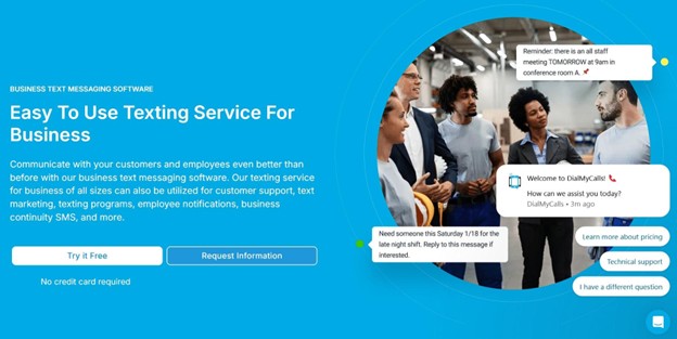
Source: dialmycalls.com
This kind of accessibility keeps users engaged, removes barriers to decision-making, and reinforces trust in their service.
Descriptive CTAs Can Inspire Action
A call to action (CTA) is one of the most important elements on a website. It’s what tells visitors what to do next (sign up, buy, subscribe, or learn more).
But vague CTAs like “Click Here” or “Get Started” don’t always work. People need clarity and motivation. A strong, descriptive CTA removes hesitation and encourages action.
Visitors won’t take action if they’re unsure what will happen next. A clear CTA eliminates confusion by telling them exactly what to expect. When it’s specific and benefit-driven, it also makes the action feel low-risk and rewarding. This can lead to higher conversions and better engagement.
An effective CTA doesn’t leave anything to guesswork. Here’s how to craft one that works:
- Be specific.
Instead of “Sign Up,” try “Create Your Free Account in Seconds.” The more direct, the better. - Highlight benefits.
Show what the user gains. “Download Your Free Guide” is more compelling than just “Download Now.” - Use action-driven language.
Phrases like “Start,” “Get,” “Try,” or “Discover” push users to take the next step. - Reduce friction.
If something is free, say so. If no credit card is needed, mention it. These details remove doubts that might prevent action.
A Brand Doing It Right: Hostinger
Hostinger, a website hosting provider, uses descriptive CTAs to encourage signups.
On their Hostinger Horizons AI Web App Builder page, the main CTA reads: “Start for free.” It’s clear and direct, leaving no room for confusion. Visitors know they can begin using the service immediately, without any cost.

Source: hostinger.com
This straightforward approach reduces hesitation and makes it easy for potential customers to take the next step.
Temporary Discounts Can Create Urgency
Price matters, especially for new customers. In fact, the majority of online shoppers are more likely to try a business if they receive a discount.
A temporary offer not only attracts potential buyers but also pushes them to act quickly before the deal disappears. When done right, discounts can drive sales without devaluing your product or service.
Scarcity is a powerful motivator. When people see a limited-time discount, they feel a sense of urgency. They don’t want to miss out. This helps eliminate hesitation and speeds up the decision-making process. Plus, discounts give customers a reason to choose your business over a competitor, especially if they’re unfamiliar with your brand.
But a well-executed discount strategy is more than just slashing prices. Here’s how to make it work:
- Set a clear expiration date.
A “limited-time offer” statement works, but being specific – like, “Offer ends in 24 hours” – is much more compelling. - Feature the deal prominently.
Don’t bury your discount in fine print. Display it where visitors can’t miss it, such as on banners, pop-ups, and checkout pages. - Make the discount meaningful.
A 5% discount might not turn heads, but 20%, 50%, or more will. Ensure it’s substantial enough to catch attention. - Remind customers before it expires.
Use email or site pop-ups to remind visitors that the deal is ending soon. This can push hesitant buyers to take action.
A Brand Doing It Right: OrthoBracing
OrthoBracing, a provider of orthopedic bracing and cold therapy machines, uses discounts effectively.
Their website opens with a header showcasing a flagship offer at 75% off. That’s a deal too big to ignore. They also make it clear that the discount is for a limited time, increasing urgency.

Source: orthobracing.com
This implementation demonstrates how time-limited offers can effectively accelerate purchase decisions, even for sensitive purchases like medical equipment.
White Space Can Highlight Key Elements
You’ve got about 15 seconds to capture a visitor’s attention and make your message stick. If your website is cluttered with too much text, images, or buttons, people won’t know where to focus. They’ll likely leave.
On the other hand, websites with enough white space get 35-45% more visual attention, making key elements stand out and improving user experience.
White space isn’t wasted space. It’s a tool that helps direct attention. By giving your most important content room to breathe, you make it easier for visitors to process information, navigate your site, and take action. A clean layout also looks more polished and professional, which increases trust in your brand.
However, using white space effectively doesn’t mean stripping your website down to nothing. Here’s how to get it right:
- Prioritize key elements.
Identify the most important messages (whether it’s a CTA, product feature, or promotion) and ensure they have enough space around them to stand out. - Make text easy to read.
Avoid large blocks of text. Break up information with headings, bullet points, and spacing to improve readability. - Keep navigation uncluttered.
A crowded menu can overwhelm visitors. Stick to essential links and allow space between buttons for a clean, easy-to-use design. - Use contrast wisely.
White space doesn’t have to be pure white. It can be any empty area that creates balance. Pairing white space with bold typography and high-quality images makes key elements pop.
A Brand Doing It Right: Agmes
Agmes, a fine jewelry brand, uses white space brilliantly.
Their website gives ample breathing room to key elements, including banners, product boxes, CTAs, navigation links, and images. This design choice makes the site feel luxurious, easy to navigate, and visually appealing.
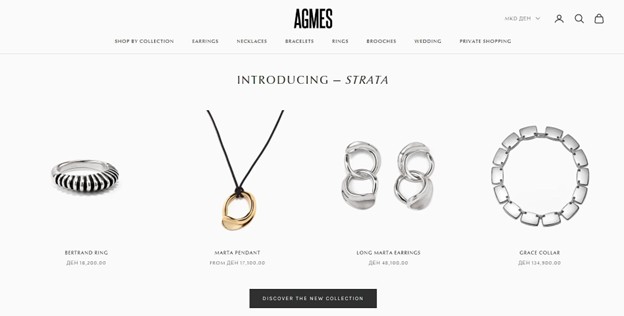
Source: agmesnyc.com
So, treat white space as an active design tool, not just an absence of content. It’s an easy trick to turn simplicity into sophistication.
Wrapping Up
Your website never calls in sick, takes a vacation, or sleeps. It’s either winning customers or losing them with every visit. What’s more, every second a visitor spends confused is a second closer to them bouncing.
But get the strategies from this post right, and suddenly, you won’t be just another option. You’ll become the obvious choice.
Your competitors are counting on you to keep putting this off. Prove them wrong.