Among the best coding fonts, Fira Code, JetBrains Mono, Consolas, Cascadia Code, and Hack are the top choices used by developers. These coding fonts are popular because they improve readability, reduce eye strain, and make it easier to scan code quickly during long sessions.
Choosing the right coding font depends on your workflow, whether you prefer ligatures, a minimal style, or better clarity in terminals. In this guide to best coding fonts, you’ll find quick picks, detailed comparisons, and use-case recommendations to help you choose the right font for your setup.
Best Coding Fonts (Top Picks for Developers)
Choosing the right coding font depends on your workflow, editor, and personal comfort. Below are some of the most widely used and trusted coding fonts, each with its own strengths.
1. Fira Code
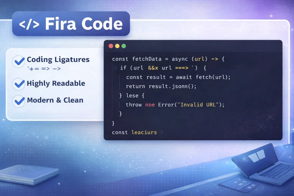
Best for: Ligatures and modern coding experience
Fira Code is one of the most popular programming fonts today. It introduces ligatures, which combine symbols like != and => into cleaner, more readable forms.
Why developers like it:
- Smooth and modern design
- Improves readability of complex operators
- Works well in most editors like VS Code
2. JetBrains Mono
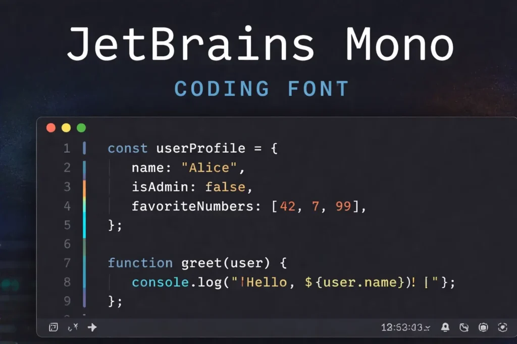
Best for: Overall readability and long coding sessions
JetBrains Mono is designed specifically for developers. It focuses on clear spacing, balanced characters, and reduced eye strain.
Key benefits:
- Excellent readability at small sizes
- Clean distinction between similar characters
- Ideal for long hours of coding
3. Consolas
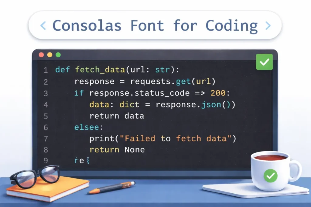
Best for: Windows users and classic coding setup
Consolas is the default coding font on Windows systems. It’s simple, reliable, and highly readable.
Why it still works well:
- Clear character shapes
- No unnecessary styling
- Great for beginners and professionals
4. Hack
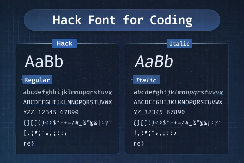
Best for: Terminal and command-line usage
Hack is optimized for low-resolution displays and terminal environments, making it a favorite for backend developers.
Highlights:
- Strong clarity in terminals
- Simple and distraction-free
- Works well in dark themes
5. Cascadia Code
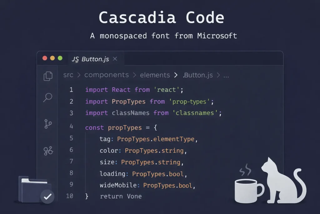
Best for: Visual Studio Code users
Cascadia Code is Microsoft’s modern coding font, built for Windows Terminal and VS Code.
Why it stands out:
6. Source Code Pro
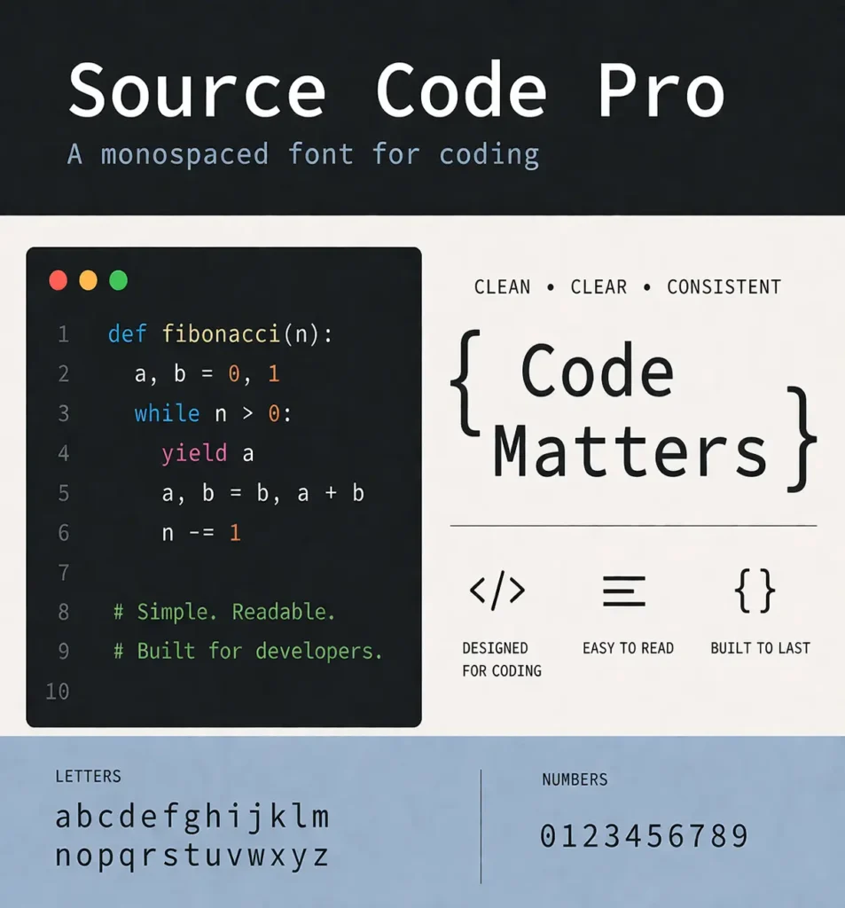
Best for: Balanced and distraction-free coding
Created by Adobe, Source Code Pro is known for its neutral and clean design.
Benefits:
- No ligatures (pure coding experience)
- Highly readable across sizes
- Open-source and widely supported
7. Inconsolata
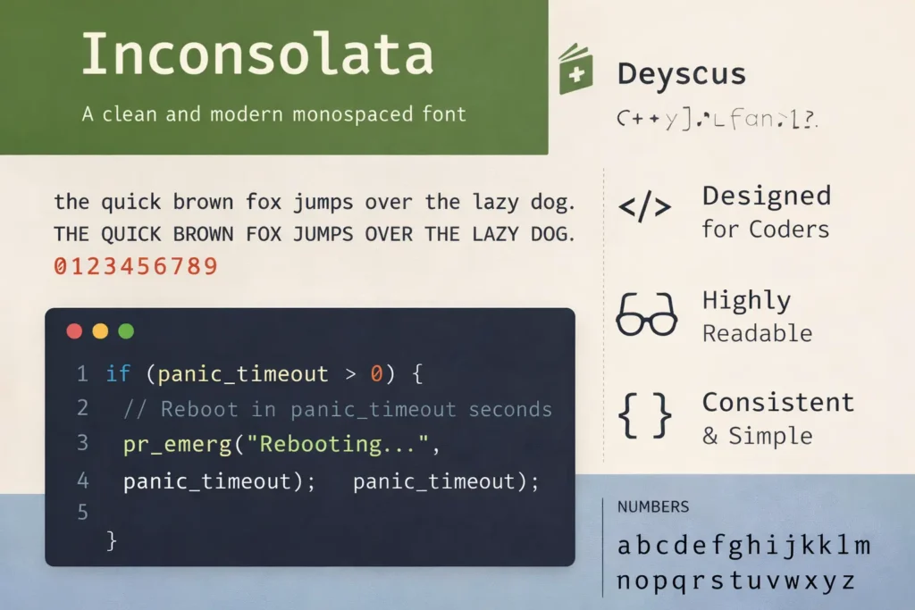
Best for: Minimal and lightweight setups
Inconsolata is a simple and clean font that works well for developers who prefer a minimal interface.
Why choose it:
- Lightweight and fast
- Clean letterforms
- Good for distraction-free coding
8. Ubuntu Mono
Best for: Linux users and readability
Ubuntu Mono is designed to match the Ubuntu ecosystem but works well everywhere.
Key strengths:
- Strong spacing and clarity
- Easy to read for long sessions
- Works great in terminals and editors
9. Menlo / Monaco
Best for: macOS developers
Menlo and Monaco are widely used coding fonts on macOS. They are known for their clean and classic look.
Why developers use them:
- Optimized for Apple displays
- Simple and readable
- Reliable default choices
Quick Comparison
| Font | Best For | Ligatures | Style |
|---|---|---|---|
| Fira Code | Ligatures | Yes | Modern |
| JetBrains Mono | Readability | Yes | Clean |
| Consolas | Windows | No | Classic |
| Hack | Terminal | No | Simple |
| Cascadia Code | VS Code | Yes | Modern |
| Source Code Pro | Balanced | No | Neutral |
| Inconsolata | Minimal | No | Clean |
| Ubuntu Mono | Linux | No | Clear |
| Menlo/Monaco | macOS | No | Classic |
How to Use This Table
- If you want ligatures: Go with Fira Code or Cascadia Code
- If readability is your priority: JetBrains Mono is a strong choice
- If you prefer default system fonts: Consolas works well on Windows
- If you mostly use terminal: Hack is optimized for it
What Are Coding Fonts?
Coding fonts are specially designed fonts used by developers when writing and reading code. Unlike regular fonts used in documents or websites, coding fonts focus on clarity, spacing, and accuracy.
Coding fonts are monospaced fonts designed for readability and clarity in programming environments.
Definition of Coding / Programming Fonts
Coding fonts (also called programming fonts or developer fonts) are typefaces built to make code easier to read, scan, and debug.
They are optimized for:
- Clear character shapes
- Consistent spacing
- Better visibility of symbols and punctuation
This makes them different from standard fonts like Arial or Times New Roman, which are designed for reading paragraphs, not code.
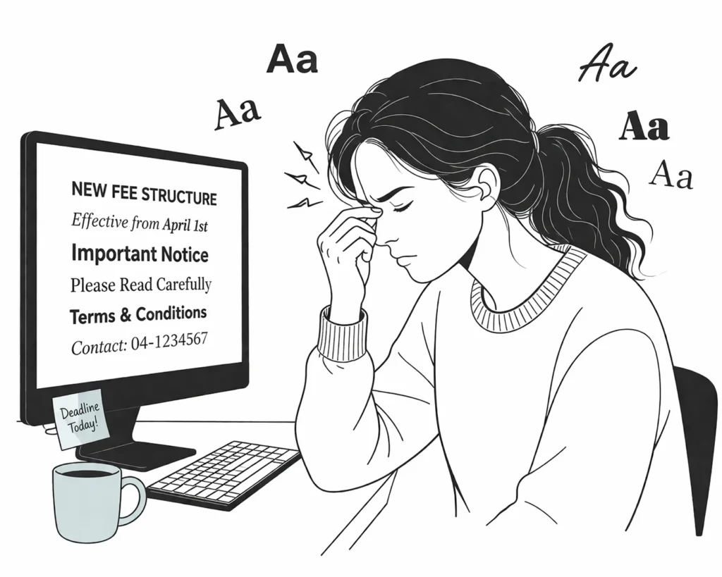
Why Developers Don’t Use Regular Fonts
Regular fonts are proportional, meaning each character takes up a different amount of space.
That creates problems in coding:
- Misaligned code structure
- Harder to scan lines quickly
- Confusing characters like:
l(lowercase L)1(one)I(uppercase i)0(zero) vsO(letter O)
In coding, even a small mistake can break everything. So readability is not optional, it’s critical.
What Are Monospaced Fonts?
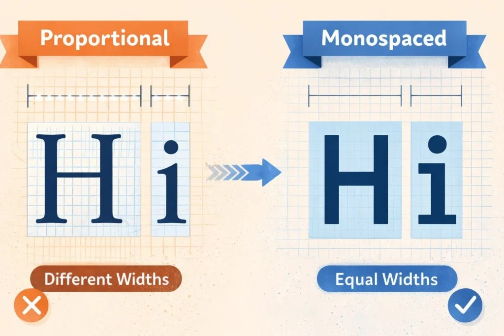
Monospaced fonts are fonts where every character takes up the same amount of horizontal space.
For example:
iandwoccupy equal width- Symbols and numbers align perfectly in columns
This uniform spacing helps developers:
- Align code neatly
- Spot errors faster
- Read large blocks of code without confusion
That’s why almost every coding environment uses monospaced fonts by default.
Common Use Cases of Coding Fonts
Coding fonts are used across all development tools and workflows:
1. IDEs (Integrated Development Environments)
Tools like Visual Studio Code or IntelliJ use coding fonts to display and edit code clearly.
2. Terminals
Command-line interfaces rely heavily on aligned text. Monospaced fonts ensure commands and outputs stay structured.
3. Code Editors
From simple editors to advanced setups, coding fonts help maintain readability across long files and complex logic.
Why Choosing the Right Coding Font Matters
The font you use while coding is not just a visual choice, it directly affects how fast you read, how accurately you write, and how long you can work without fatigue. A poorly chosen font can slow you down, while the right one makes coding smoother and less tiring.
Improves Readability
One of the biggest advantages of good coding fonts is clear character distinction.
In programming, many characters look similar:
l(lowercase L)1(number one)I(uppercase i)0(zero) vsO(letter O)
A well-designed coding font makes each of these visually distinct, so you don’t misread them.
This is especially important when:
- Reading someone else’s code
- Debugging long scripts
- Working with complex syntax
Reduces Eye Strain
Developers often spend hours staring at code. A poor font can quickly lead to fatigue.
Good coding fonts help by:
- Keeping letters well-spaced
- Avoiding cramped or overly thin characters
- Staying readable even at smaller sizes
This reduces:
- Eye strain
- Headaches
- Mental fatigue during long sessions
Helps Prevent Bugs
Small mistakes in code can lead to big problems. And sometimes, those mistakes come from simply misreading a character.
For example:
- Confusing
=with== - Mistaking
0forO - Missing a symbol in dense code
A clear font reduces these risks by making:
- Symbols more visible
- Structure easier to follow
- Errors easier to catch
Boosts Productivity
When your font is easy to read, everything becomes faster.
You can:
- Scan code quickly
- Understand logic without slowing down
- Debug issues with less effort
Over time, this leads to:
- Faster development
- Fewer mistakes
- Better overall workflow
Fonts With Ligatures vs Without Ligatures
When choosing a coding font, one of the biggest decisions is whether to use ligatures or stick with a traditional style. Both options have their own advantages, and the right choice depends on how you prefer to read code.
What Are Ligatures?
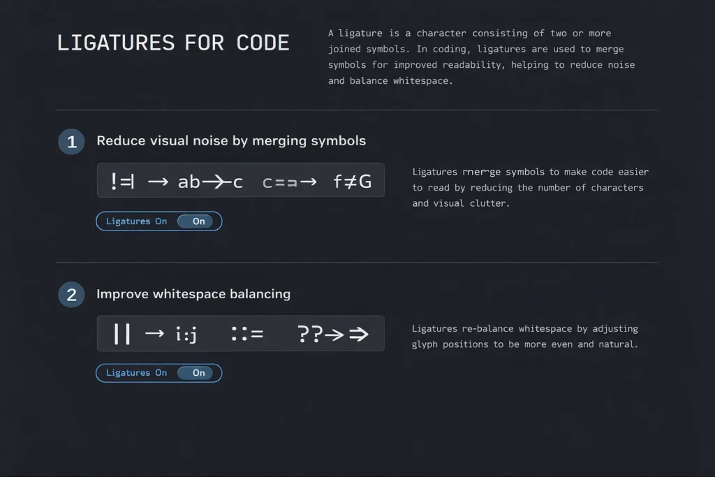
Ligatures are a feature in some coding fonts where multiple characters are combined into a single visual symbol.
For example:
!=may appear as a single symbol=>can look like an arrow===may be visually grouped
Fonts like Fira Code and Cascadia Code use ligatures to make code look cleaner and easier to scan.
Pros of Ligatures
1. Cleaner Symbols
Ligatures simplify complex operators by turning them into clearer visual forms.
2. Better Readability
Instead of reading separate characters, your eyes process them as one unit. This can make code easier to understand at a glance, especially in logic-heavy sections.
Cons of Ligatures
1. Can Confuse Beginners
If you’re new to coding, ligatures might hide the actual characters behind symbols. This can make it harder to learn syntax properly.
2. Not Always Preferred
Some developers prefer to see code exactly as it is typed, without visual transformations.
Should You Use Them?
It depends on your experience and workflow:
- Use ligatures if:
- You want cleaner-looking code
- You work with complex operators often
- You prefer a modern coding experience
- Avoid ligatures if:
- You’re a beginner
- You want a traditional, literal view of code
- You find combined symbols distracting
Best Coding Fonts by Use Case
Not every developer works the same way. Your ideal coding font depends on your tools, environment, and comfort. Here’s a breakdown of the best fonts based on specific use cases.
Best Fonts for VS CodeIf you use Visual Studio Code, these fonts work exceptionally well:
- Fira Code → Great for ligatures and modern UI
- Cascadia Code → Built by Microsoft for VS Code
- JetBrains Mono → Clean and highly readable
These fonts integrate smoothly with VS Code settings and support features like ligatures and syntax highlighting.
Best Fonts for Web Developers
Web developers often work with HTML, CSS, and JavaScript, where readability and structure matter.
Best choices:
- JetBrains Mono → Clear spacing for nested code
- Source Code Pro → Balanced and distraction-free
- Fira Code → Helpful for reading complex JS operators
These fonts make it easier to scan long lines and understand layout structure.
Best Fonts for Terminal
Terminal environments need fonts that stay clear even in compact layouts.
Top picks:
- Hack → Designed specifically for terminal use
- Ubuntu Mono → Strong clarity and spacing
- Consolas → Reliable for Windows terminals
These fonts ensure commands, logs, and outputs remain easy to read.
Best Fonts for Long Coding Sessions
If you code for hours, comfort becomes critical.
Best options:
- JetBrains Mono → Designed to reduce eye strain
- Source Code Pro → Neutral and easy on the eyes
- Cascadia Code → Smooth and modern readability
These fonts help you stay focused without fatigue during long sessions.
Best Fonts for Beginners
Beginners should focus on simplicity and clarity.
Recommended fonts:
- Consolas → Simple and widely available
- JetBrains Mono → Clear distinction between characters
- Inconsolata → Minimal and easy to read
Avoid ligatures at the start so you can clearly see every character.
Serif vs Sans Serif vs Monospace (Quick Guide)
Before choosing a coding font, it helps to understand the three main font types. Each has a different purpose, but only one is truly suited for programming.
Serif Fonts → Traditional Readability
Serif fonts have small strokes (called “serifs”) at the ends of letters.
Common examples:
- Times New Roman
- Georgia
Best for:
- Printed books
- Long-form reading
They improve readability in print, but are not ideal for coding due to uneven spacing.
Sans-Serif Fonts → Modern & Screen-Friendly
Sans-serif fonts remove those small strokes, giving a cleaner and more modern look.
Common examples:
- Arial
- Helvetica
Best for:
- Websites
- User interfaces
- Mobile screens
They are easier to read on screens but still not suitable for coding because they are usually proportional.
Monospace Fonts → Best for Coding
Monospace fonts are designed so every character has equal width.
Examples:
- Fira Code
- JetBrains Mono
- Consolas
Why they are perfect for coding:
- Align code neatly
- Make structure easy to scan
- Improve readability of symbols and indentation
How to Choose the Best Coding Font
Choosing the right coding font is not about trends, it’s about what helps you read and write code comfortably. The best approach is to test a few options and fine-tune them based on your workflow.
Step-by-Step Process
Follow this simple process to find the best coding font for your setup:
1. Pick Monospaced Fonts
Start by selecting only monospaced fonts.
- They keep your code aligned
- Make indentation clear
- Help you scan code faster
Avoid proportional fonts, they break structure and make code harder to read.
2. Test Readability
Open your editor and try a few fonts with real code.
Check:
- Can you easily distinguish
l,1,I,0,O? - Are symbols and brackets clear?
- Does the font feel comfortable after a few minutes?
If you struggle to read quickly, skip that font.
3. Decide on Ligatures
Now choose whether you want ligatures.
- Enable ligatures if you like cleaner symbols (
!=,=>) - Disable ligatures if you prefer exact character display
This is a personal preference, there’s no right or wrong choice.
4. Check IDE Compatibility
Make sure your font works smoothly in your coding environment.
For example:
- Visual Studio Code supports ligatures and custom font settings
- Some terminals may need extra configuration
Always test the font inside your actual workflow.
5. Adjust Size & Spacing
Even the best font won’t work if the settings are off.
Fine-tune:
- Font size (usually 14–18px works well)
- Line height (for better spacing between lines)
- Letter spacing (optional, based on preference)
Small adjustments can make a big difference in comfort.
Best Font Size and Settings for Coding
Choosing the right font is only half the job. Your font size, spacing, and theme play a big role in how comfortable and readable your code feels during daily work.
Ideal Font Size: 14–18px
Most developers find the sweet spot between 14px and 18px.
- 14px–15px → More code fits on screen (good for experienced users)
- 16px → Balanced and comfortable for most people
- 17px–18px → Better for long sessions and reduced eye strain
If you squint or lean forward to read your code, your font size is too small.
Line Height Recommendations
Line height (spacing between lines) directly affects readability.
Recommended range:
- 1.4 to 1.6 line height
Why it matters:
- Prevents lines from looking cramped
- Makes it easier to track code visually
- Reduces strain when reading long files
Too tight = cluttered
Too loose = wasted space
Dark vs Light Theme Pairing
Your font should match your theme for the best experience.
Dark Theme
- Easier on the eyes in low-light environments
- Reduces glare
- Works well with slightly larger font sizes
Light Theme
- Better in bright environments
- Often provides sharper contrast
- Good for daytime coding
The key is contrast:
- Text should stand out clearly from the background
- Avoid low-contrast color combinations
Common Mistakes When Choosing Coding Fonts
Picking a coding font seems simple, but many developers make small mistakes that hurt readability and slow down their workflow. Avoid these common issues to get the best experience.
Using Proportional Fonts
One of the biggest mistakes is using proportional fonts (like Arial or Times New Roman).
- Characters have different widths
- Code alignment breaks
- Indentation becomes harder to follow
Always use monospaced fonts for coding to keep structure clear and consistent.
Ignoring Readability
Some fonts may look good but are hard to read in practice.
Problems to watch for:
- Similar-looking characters (
l,1,I,0,O) - Thin or blurry letterforms
- Poor spacing between symbols
If you need extra effort to read your code, the font is not right.
Choosing Style Over Function
A font might look modern or stylish, but that doesn’t mean it’s good for coding.
- Fancy designs can reduce clarity
- Ligatures may not suit everyone
- Overly stylized fonts can slow you down
Always prioritize function and readability over appearance.
Not Testing Fonts
Many developers pick a font based on recommendations without testing it.
Instead:
- Try the font with real code
- Use it for a few hours
- Check comfort and readability
What works for others may not work for you.
Free vs Paid Coding Fonts
When choosing a coding font, you’ll come across both free and paid (premium) options. The good news is that many free fonts are already excellent. Paid fonts, however, may offer extra polish and customization.
Best Free Fonts
These free fonts are widely used and trusted by developers:
Fira Code
- Supports ligatures
- Modern and clean design
- Works across all platforms
JetBrains Mono
- Designed specifically for developers
- Excellent readability
- Comfortable for long coding sessions
Source Code Pro
- Clean and distraction-free
- No ligatures (pure coding experience)
- Open-source and stable
For most developers, these free fonts are more than enough.
Premium Fonts
Premium fonts are paid options that offer additional refinement and unique styles.
PragmataPro
- Highly customizable
- Optimized for dense code
- Supports many languages and symbols
Operator Mono
- Stylish design with cursive italics
- Popular among developers who prefer a distinct look
These fonts are often chosen for personal preference and aesthetics, rather than necessity.
Free vs Paid: Which Should You Choose?
| Feature | Free Fonts | Paid Fonts |
|---|---|---|
| Cost | Free | Paid |
| Readability | Excellent | Excellent |
| Features | Standard + ligatures | More customization |
| Use Case | Most developers | Advanced users / preference |
FAQs (People Also Ask Optimization)
These are common questions developers search for when choosing the best coding fonts. Answering them clearly helps improve rankings and capture featured snippets.
1. What font is best for coding?
There is no single “best” font for everyone, but some fonts consistently perform well.
Top choices:
- JetBrains Mono → Best for readability
- Fira Code → Best for ligatures
- Consolas → Simple and reliable
- Cascadia Code → Great for modern setups
The best font is the one that feels comfortable for your eyes and improves your reading speed.
2. Is Fira Code better than JetBrains Mono?
It depends on your preference.
- Fira Code
- Supports ligatures
- Better for reading complex operators
- More modern look
- JetBrains Mono
- Focuses on pure readability
- No unnecessary visual changes
- Better for long coding sessions
If you like ligatures, go with Fira Code. If you want clarity and simplicity, choose JetBrains Mono.
3. What font do most programmers use?
Most programmers use monospaced fonts because they keep code aligned and readable.
Popular choices include:
- Fira Code
- JetBrains Mono
- Consolas
- Source Code Pro
These fonts are widely used because they balance readability, clarity, and comfort.
4. Are ligatures good for coding?
Ligatures can improve readability, but they are optional.
Good for:
- Cleaner visual representation of symbols
- Faster scanning of complex code
Not ideal for:
- Beginners learning syntax
- Developers who prefer exact character display
Many developers try ligatures and decide based on comfort.
5. What is the most readable font for programming?
JetBrains Mono is often considered one of the most readable coding fonts.
Why:
- Clear distinction between similar characters
- Balanced spacing
- Easy to read at small sizes
Other highly readable options:
- Source Code Pro
- Consolas
Readability depends on your setup, so it’s always best to test fonts yourself.
Conclusion
There’s no single “best” coding font that works for everyone. The right choice depends on your comfort, workflow, and how you prefer to read code.
A smart starting point is:
- Fira Code → If you want ligatures and a modern feel
- JetBrains Mono → If you want maximum readability and comfort
From there, the key is simple:
- Test different fonts in your editor
- Adjust size and spacing
- Use them during real coding sessions
The best coding font is the one that helps you read faster, make fewer mistakes, and stay comfortable for longer.